

Flag to be introduced at event on Nov. 28
VANCOUVER – The Vancouver City Council unanimously voted to adopt a new flag after the community-led Flag Selection Committee presented its recommendation to the Council tonight.
“This flag is the result of thoughtful collaboration and creative input from across our community,” said Rose Mendoza, chair of the Flag Selection Committee. “Every element in the design reflects something meaningful about Vancouver, and it is a symbol we can all be proud of now and into the future.”
“Our new flag is a powerful reflection of who we are as a city,” said Mayor Anne McEnerny-Ogle. “It represents our natural surroundings, the iconic places that define Vancouver, and the creativity that makes our community special. This flag truly tells the story of a community on the rise.”
Residents were involved throughout the process. The City Council appointed a volunteer committee to select the flag from the 138 entries submitted. Once the committee selected the finalists, the City invited the public to provide feedback on them (1,438 responses were received). The committee used this feedback to inform deliberations and the final flag recommendation to the City Council. To ensure a fair and impartial selection process, all entries were reviewed anonymously, without identifying information. During the review, judges independently created two composite flags by combining elements from multiple submissions they felt worked well together. The original creators whose designs inspired these composites were credited for their contributions.
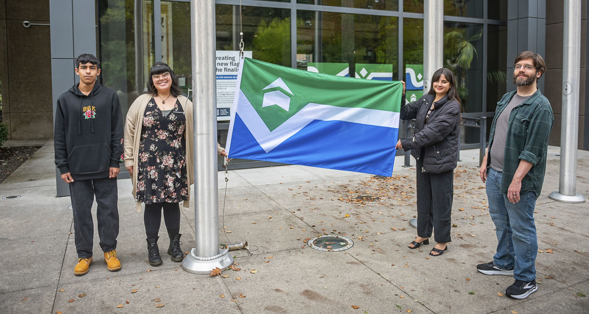
Ultimately, the committee recommended a composite flag composed of elements from the flags created by Brooke Nugent and Nathan Hunter as the next flag for Vancouver. The new flag tells the story of a community shaped by the Columbia River, a deep sense of place, and the generations of people who have called this land home.
- The field of green symbolizes Vancouver’s natural environment, forests, parks, and commitment to sustainability.
- The emblem draws inspiration from iconic Vancouver landmarks (Fort Vancouver, Salmon Run Bell Tower, and the Grant Street Pier). It is a nod to the past and a symbol of forward progress.
- The white chevron is a strong V for Vancouver, a connection between the land and the water, and a path forward.
- The field of blue represents the Columbia River and the community’s deep connection to the river that has shaped its culture, economy, and sense of place.
“Vancouver’s flag is meant to be shared, celebrated, and seen throughout our community and beyond,” said Communications Director Laura Shepard. “It is available for creative use, whether you want to print it on a T-shirt, make stickers, design merchandise, or even get a tattoo of the new flag. The only requirement is to keep the colors and layout true to the design. People can download the official files from our website and start creating.”
The new flag will be formally raised on the City Hall flagpole at approximately 3:00 p.m. on Friday, Nov. 28, followed by a community introduction and official prize presentation at 3:45 p.m. as part of the annual tree lighting celebration.
Visit Vancouver’s Flag to learn more about the new flag.
Information provided by the city of Vancouver.
Also read:
- Ridgefield School District to host multi-agency emergency preparedness exercise
 Multi-agency exercise at Ridgefield High School will simulate environmental hazard scenario on Friday.
 - Top talent headlining concerts announced with music ticket sales opening for the 2026 Clark County Fair
 GRAMMY-nominated Midland, I Love The ’90s Tour, and Collective Soul headline the 2026 Clark County Fair concert series.
 - Opinion: Cowards in black robes
 Judge refuses emergency protection for constitutional sheriffs facing removal by unelected board.
 - Battle Ground Public Schools plant sales set to begin
 High school students grow annuals, perennials, and native plants for three upcoming community sales in April and May.
 - Opinion: Internal emails show income tax bill was designed to bypass the Constitution and lock out voters
 Internal communications show legislators and AG’s office strategically designed income tax bill to prevent public referendum while forcing Supreme Court review.
 - GiveBig is coming Tuesday, May 5
 Vancouver cat rescue seeks $10,000 during one-day online fundraising challenge to cover extraordinary medical expenses.
 - Letter: HB 2266 and fairness for Clark County communities
 Vancouver resident argues the housing bill expands placement options while limiting local government oversight of siting decisions.